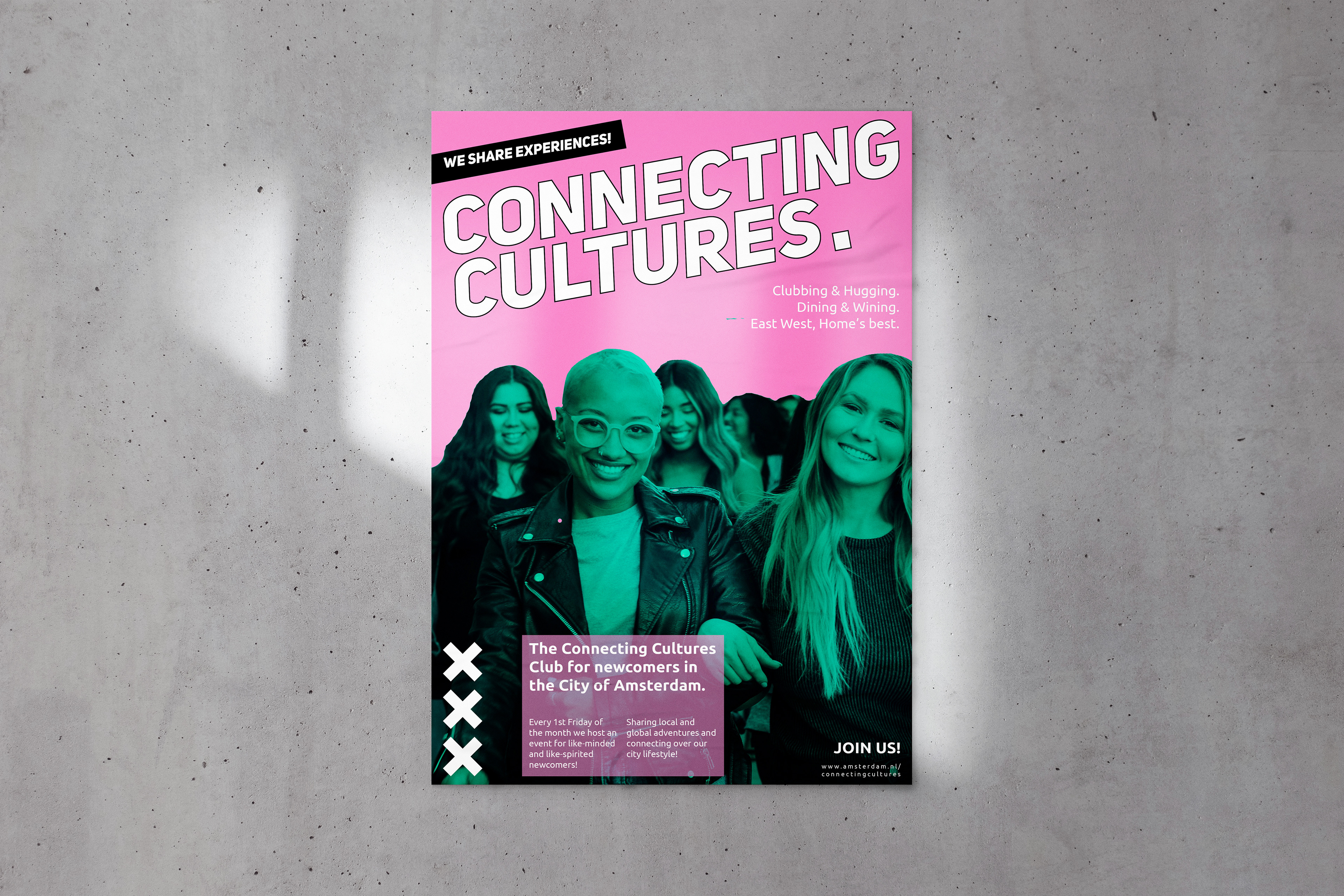
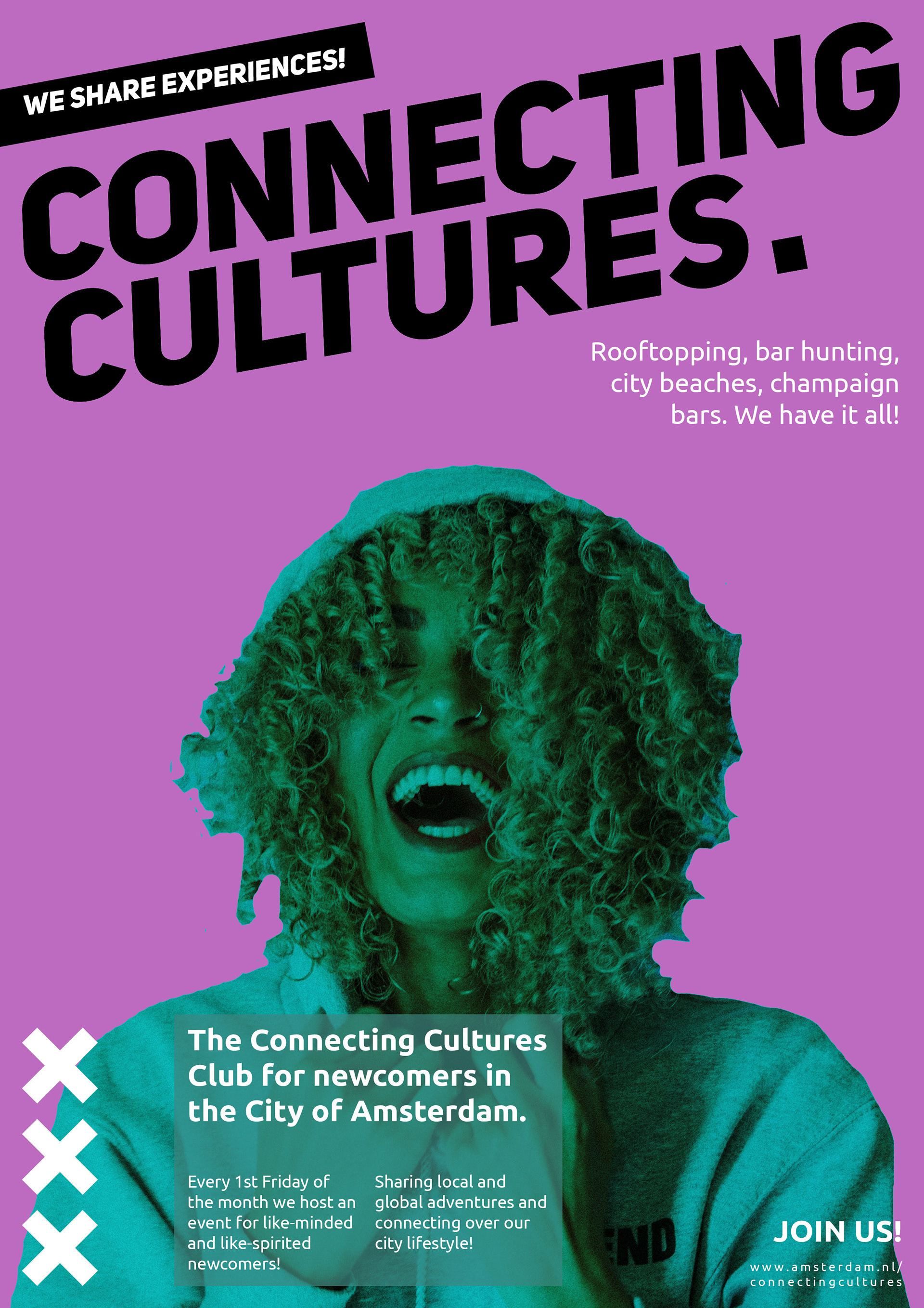
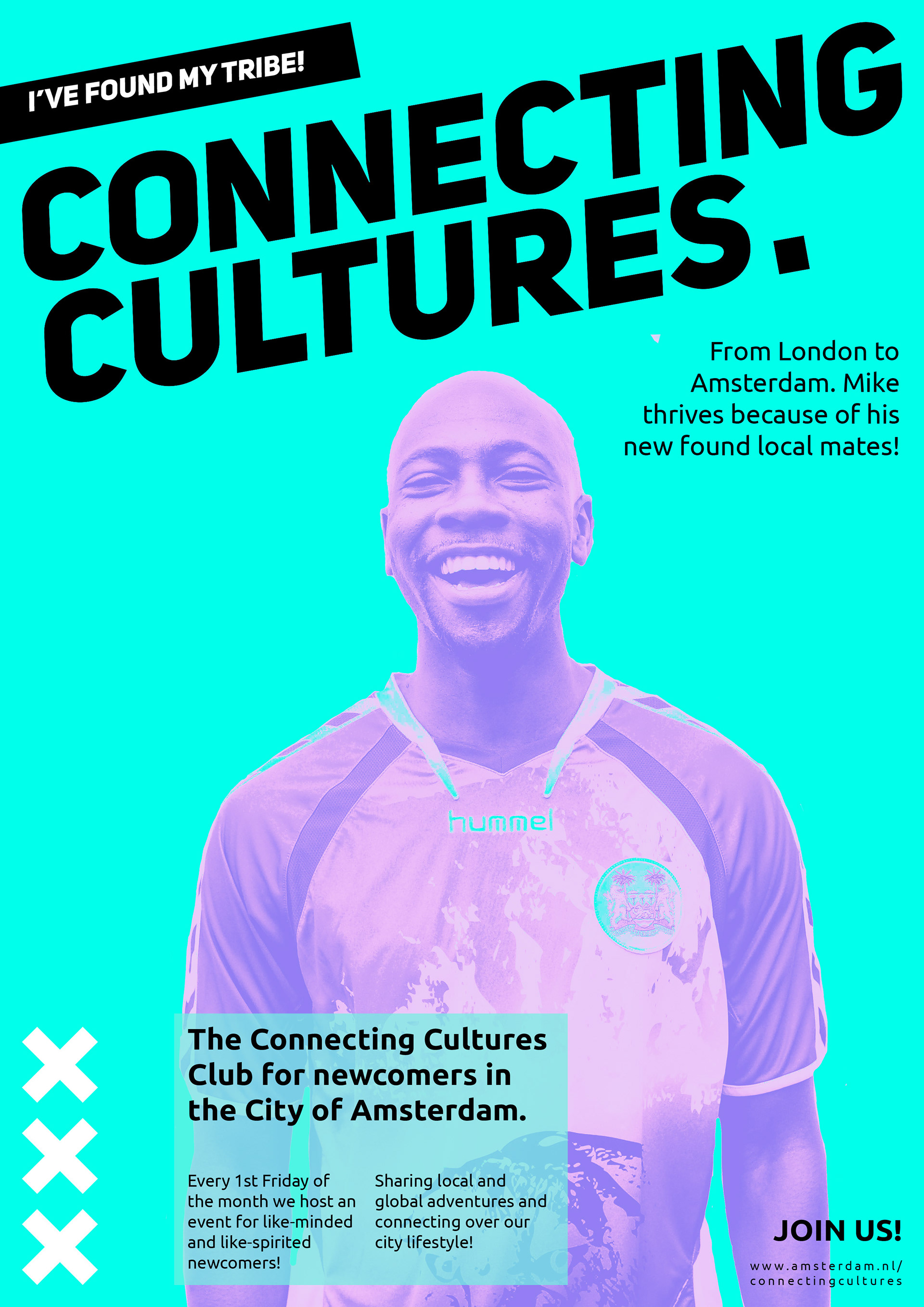
The City that makes your Heart sing.
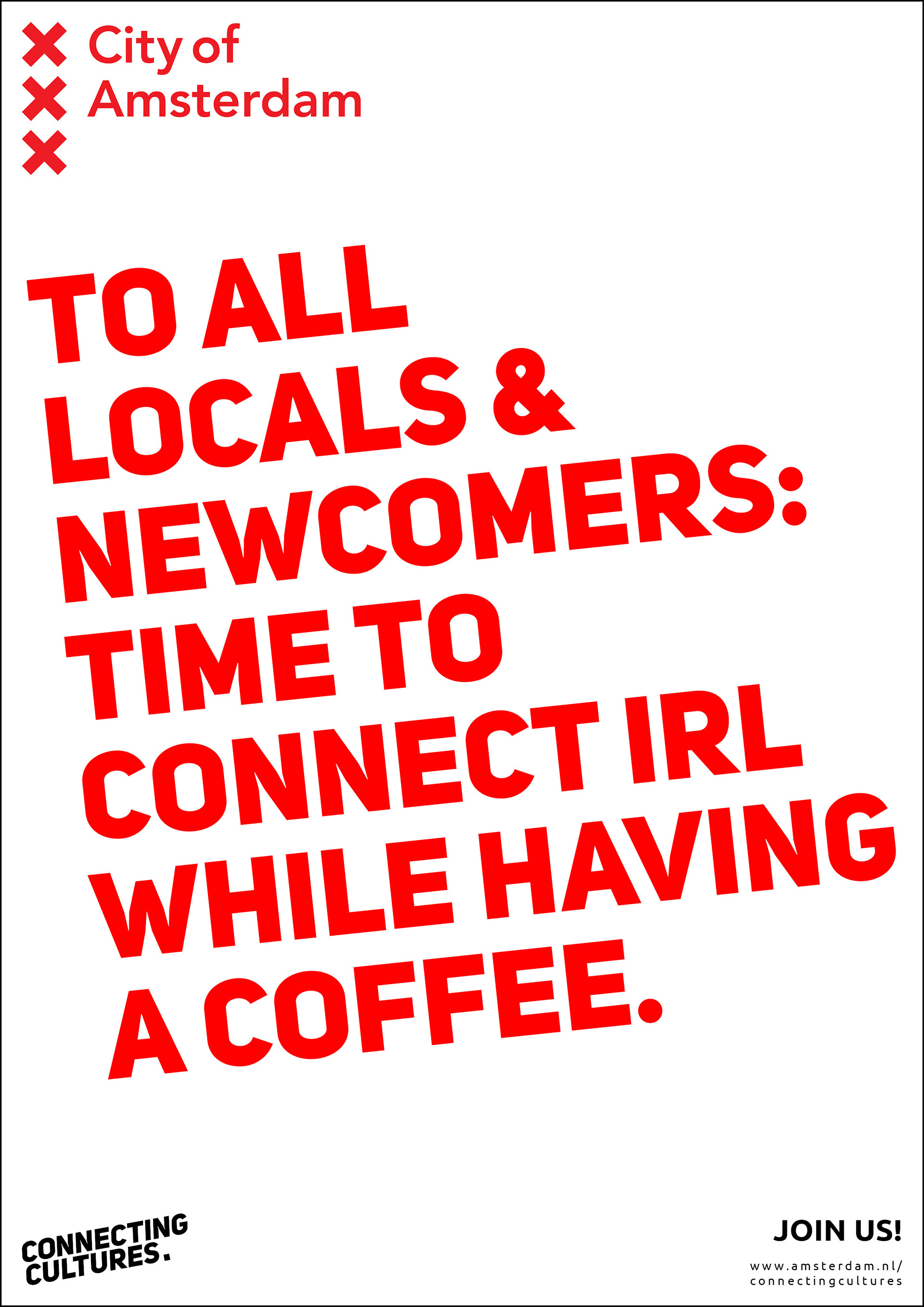
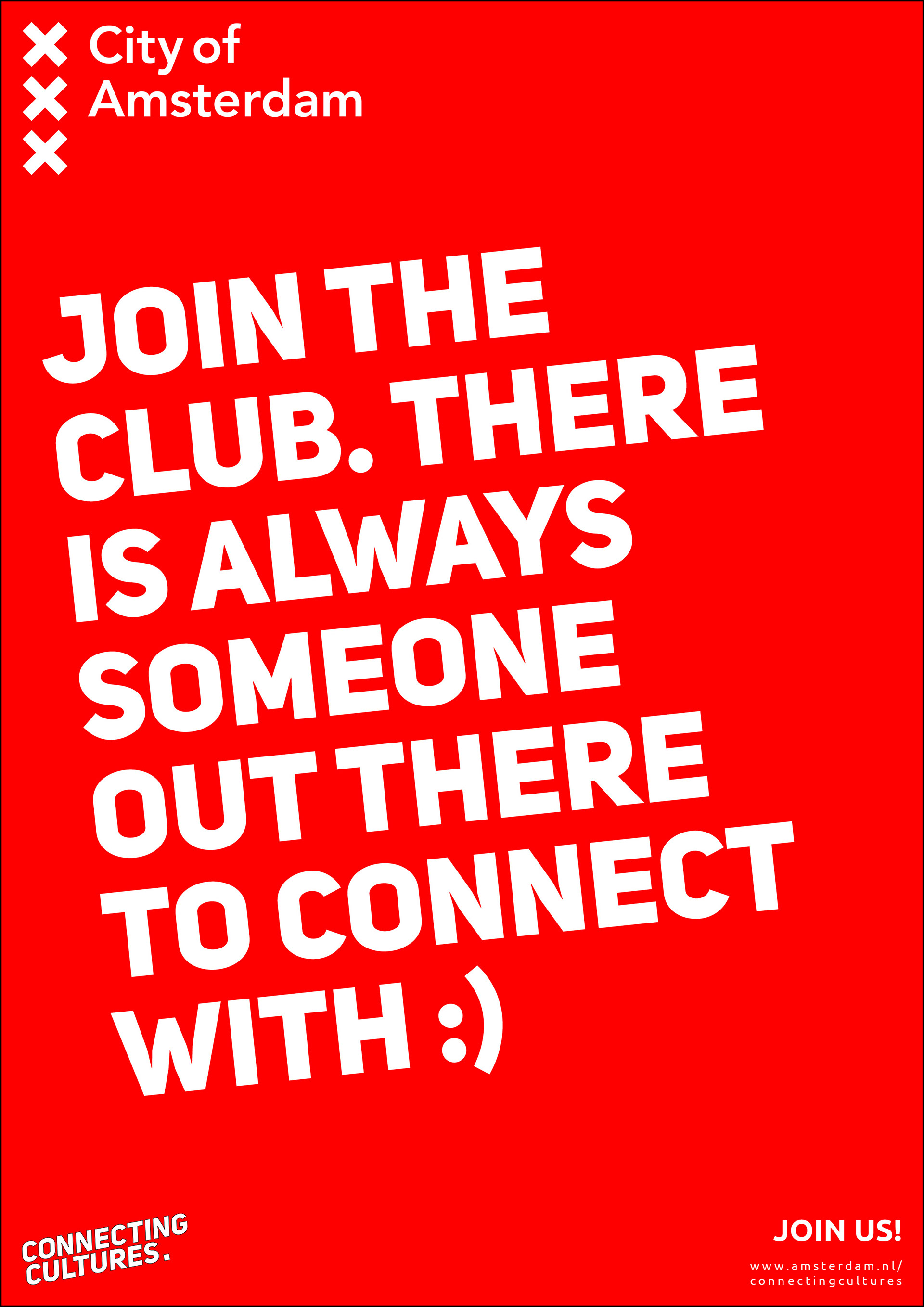
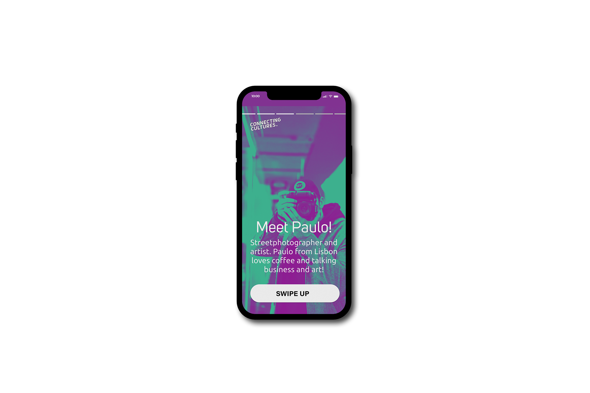
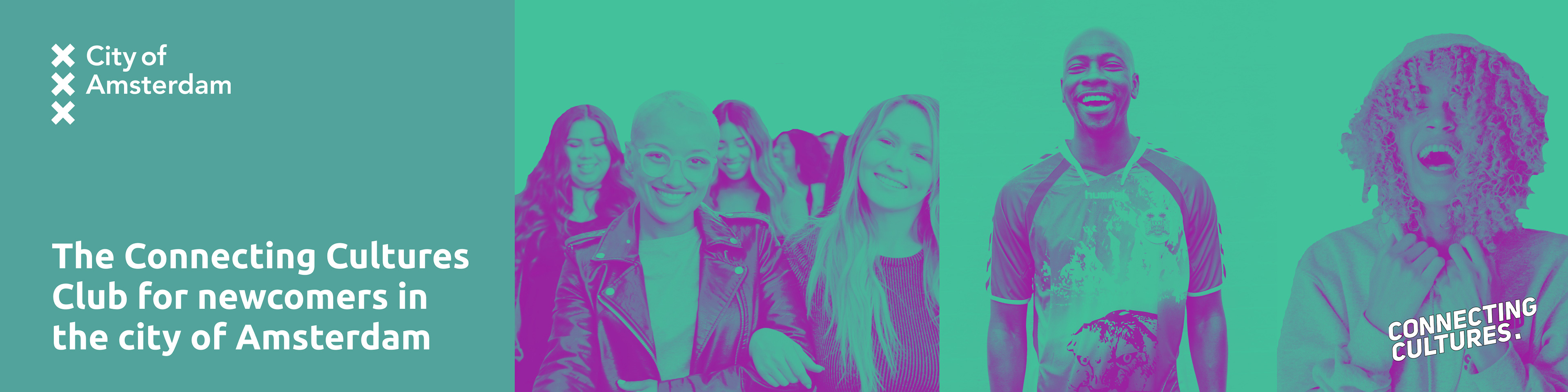
Creating cultural experiences and an inclusive culture for newcomers in the city of Amsterdam. Everyone wants to feel they belong somewhere and where better to establish connection in such a diverse and free city as Amsterdam! A city campaign that connects newcomers and professionals to locals and other new bees. A step into the unknown for multiple targets groups.
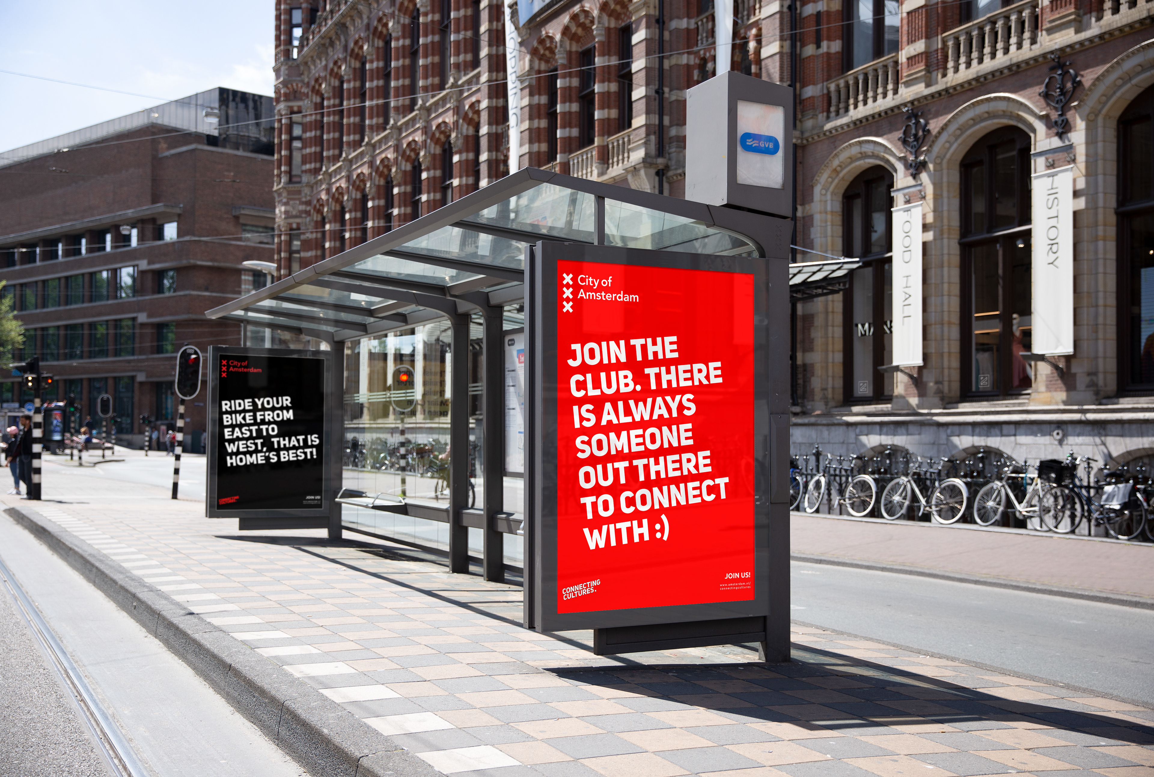
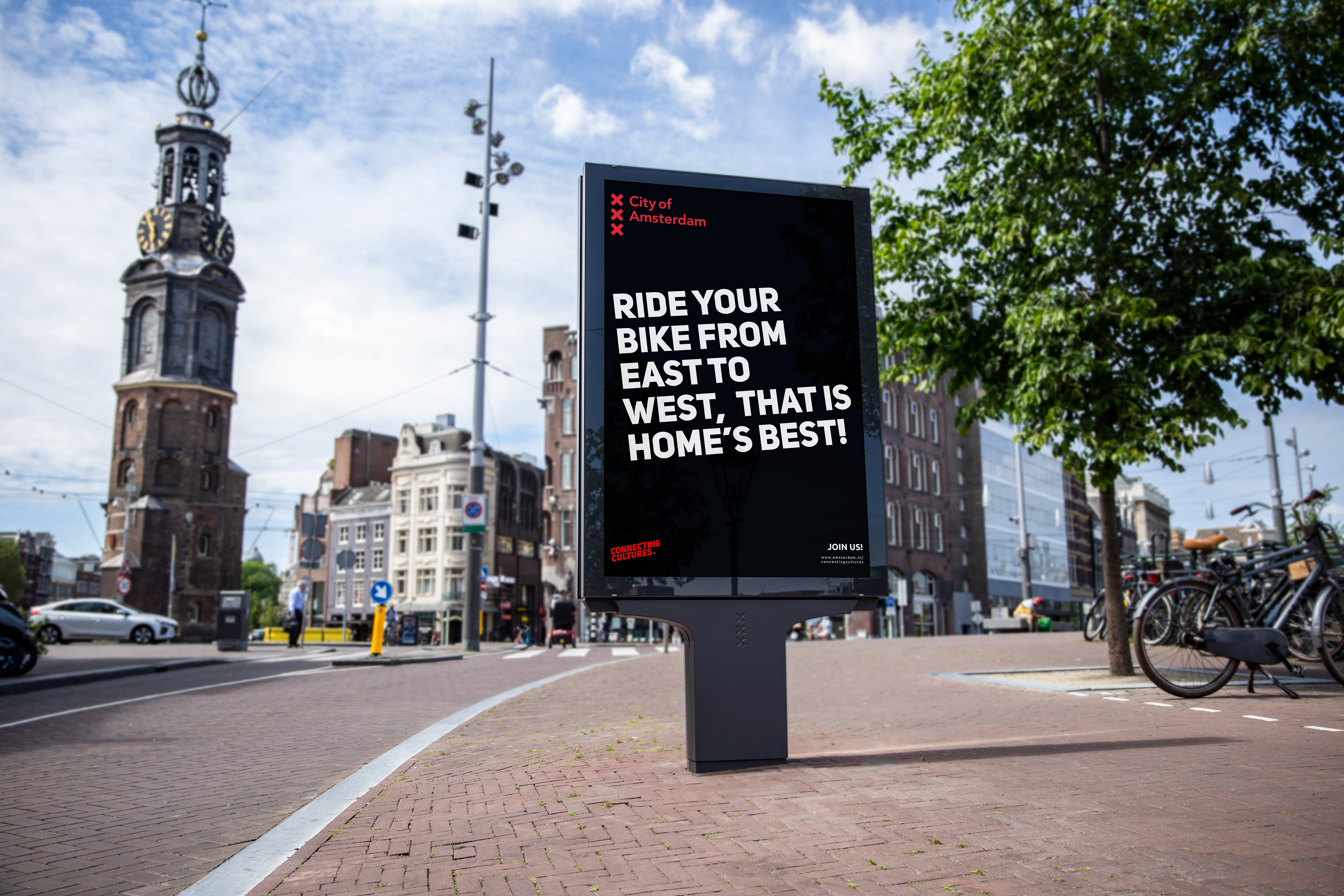
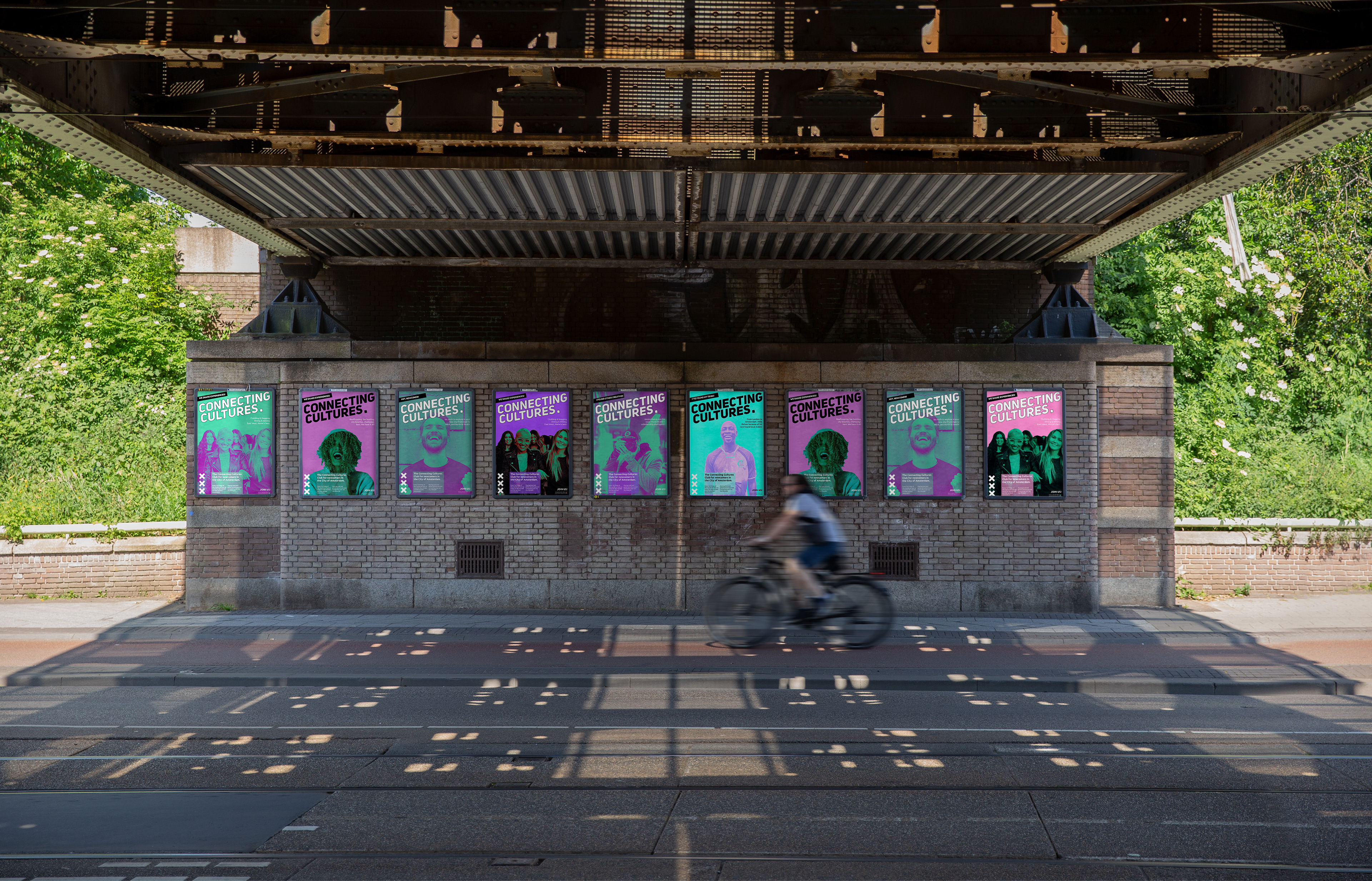
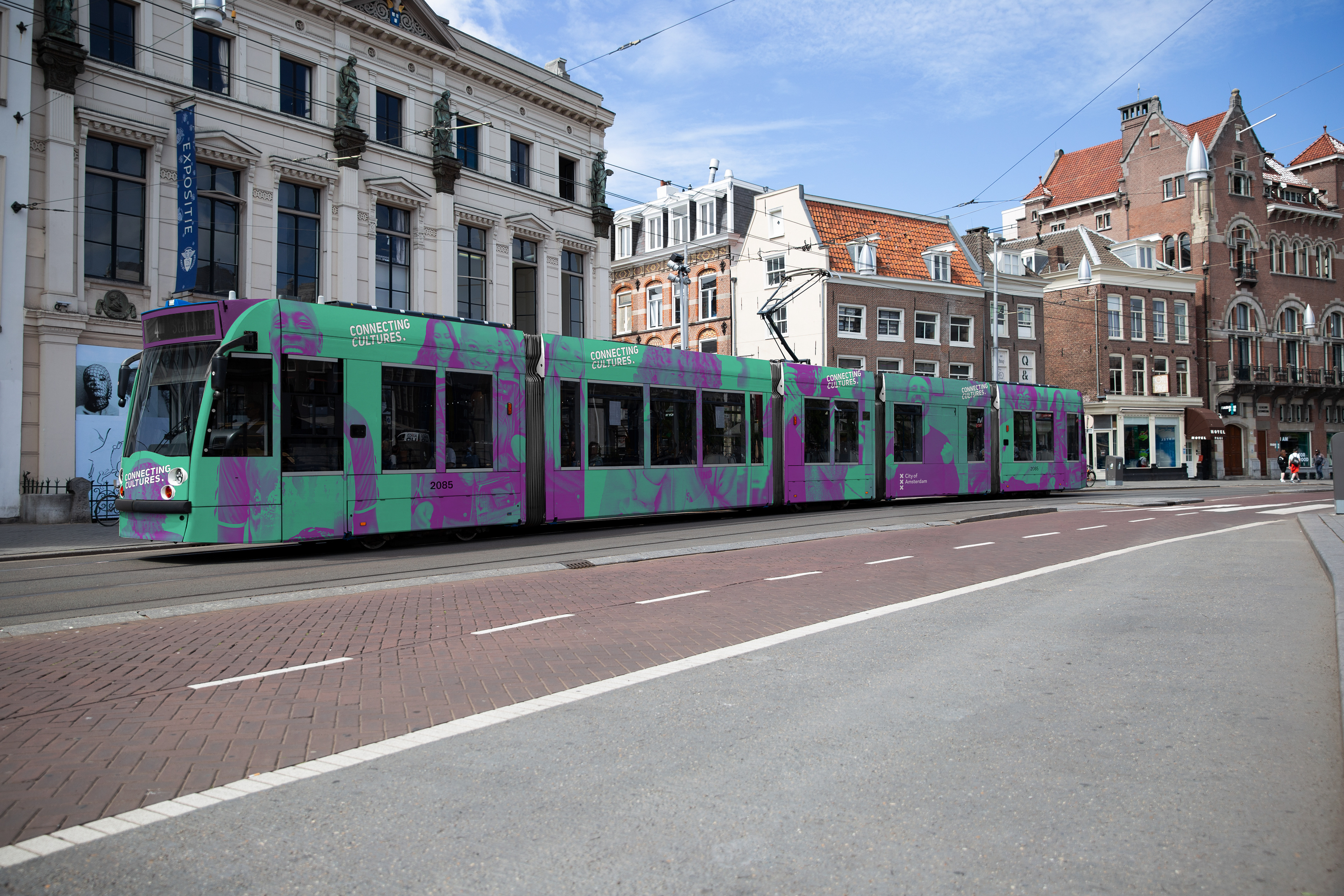
This is an opportunity to rebrand how The City of Amsterdam communicates with its locals in the public space. Combining the city colour palette with a brand new design direction is key to a successful rollout!
As a city resident you probably don’t see any of the city marketing anymore, but when it’s good you will see it.
While thumb-nailing and crafting ideas my mind was on the city and I questioned myself - as a local Amsterdammer - what would catch my eye in the public space? How is it now and how could I freshen up the space with a new design direction? One answer to that is color. Second
it’s slang - the visual representation, communication and design of the ‘product’. In this case: all posters, billboards, vehicles wraps and all unofficial poster walls.
it’s slang - the visual representation, communication and design of the ‘product’. In this case: all posters, billboards, vehicles wraps and all unofficial poster walls.

Visual Inspiration & kickstart design direction


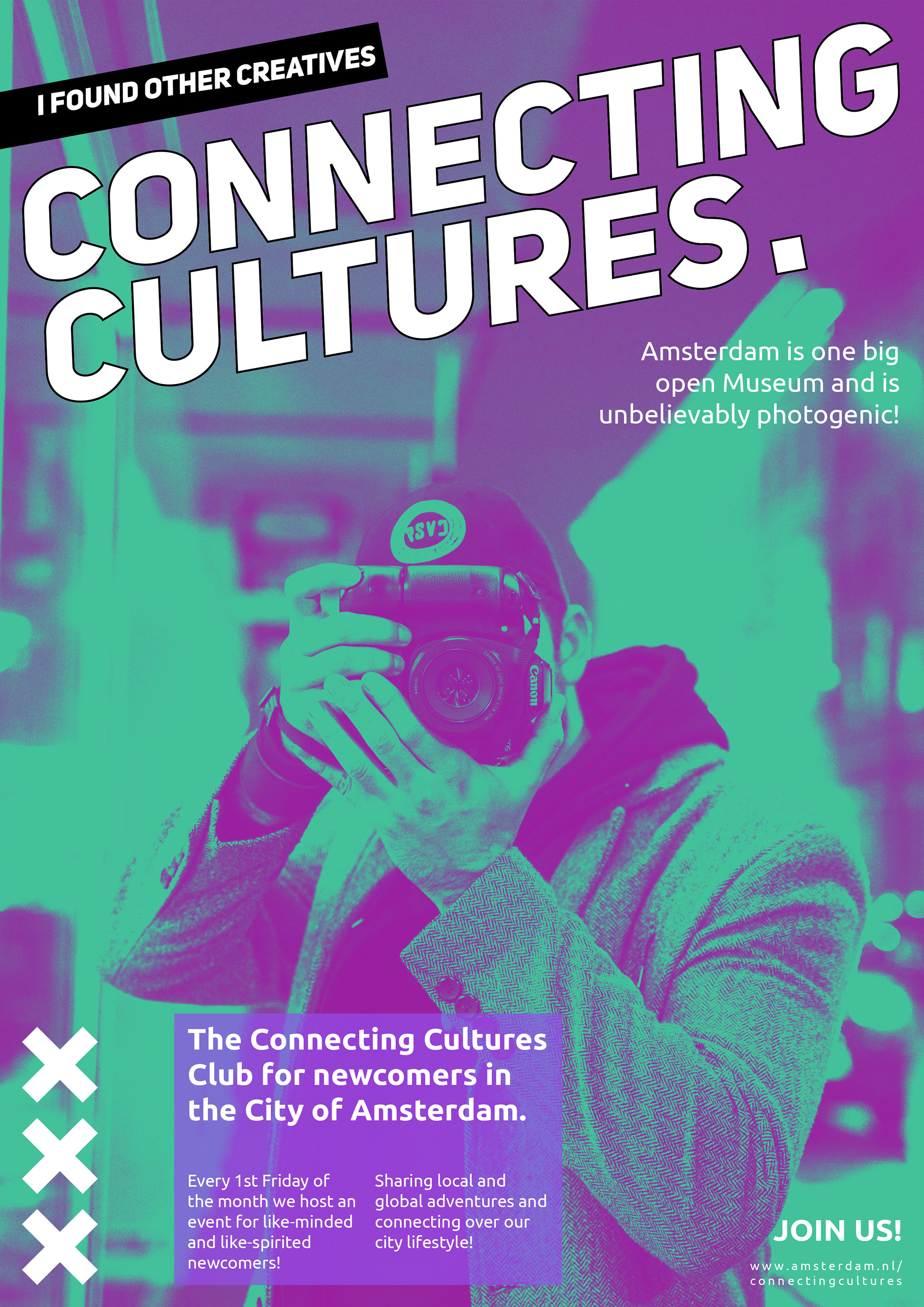


source: www.unsplash.com for the photos used in poster design.